
Podcast
The election campaign is tight, who is running the most skilful campaign? The well-known advertiser Thomas Strerath, managing director at MediaMonks and ex-boss at Jung von Matt, dissects the messages of the parties.
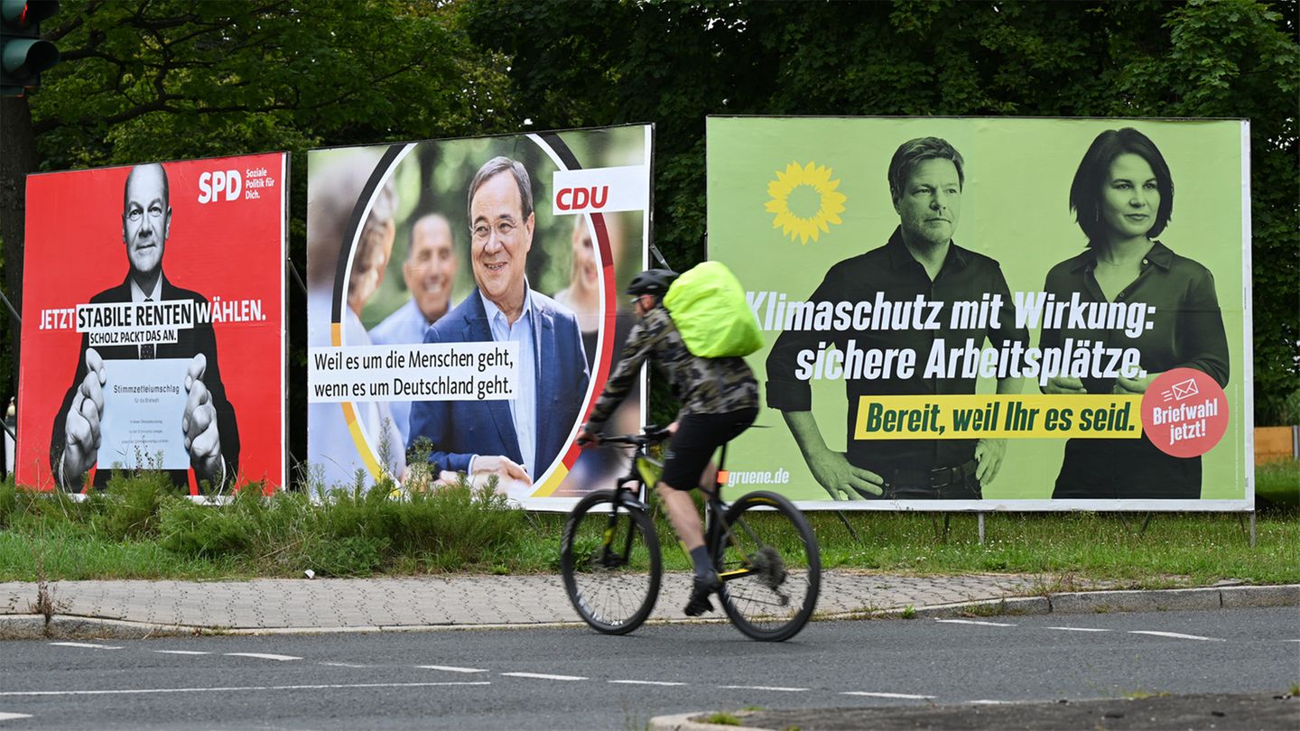
A black and white Olaf Scholz on a red background with short messages on it: secure pensions, minimum wage 12 euros, affordable housing. Plus: Scholz tackles it. “A very strong campaign visually”, thinks Thomas Strerath. the advertiser and managing director of MediaMonks analyzes the campaigns of the parties – and it is clear to him: “The SPD has by far the best campaign”. The terms are “Packaged in a way that is easy to understand”that it signals a strong claim to leadership and that is how the SPD succeeds in communicating a clear message. “And that’s what Scholz embodies: He doesn’t let himself be disturbed.”
It is precisely this focus and clarity that is missing from its two main competitors, the CDU and the Greens. The CDU campaign certifies Strerath “lack of focus, exaggeration, concreteness”: “You try so hard to accommodate everything and in the end nothing succeeds”, criticized the former director of the agency von Jung von Matt. “One tries not to offer an attack surface”, which does not allow a negative demarcation from the other parties, according to Strerath, who was one of the heads behind the CDU campaign in 2017 (“For a country in which we live well and happily”). For the first time, in the interview, he also describes how the campaign came about – and with which slogan he originally started the race.
The Greens pale, the FDP self-absorbed
The Greens are even worse at demarcating, he thinks. The party could not really decide between Annalena Baerbock and Robert Habeck, and from that “there is no claim to leadership at all”. The design of the posters looks like “like a corpse of water” and show “how pale the entrance is”. The film in which the Greens play the folk song “Not a beautiful country” set to music would serve all the old stereotypes about the Greens. Strerath’s judgment: “The green appearance is the worst of all appearances.”
The advertiser is also more critical of the FDP campaign, which set standards in 2017 and was award-winning. Because she is trying to repeat the campaign from four years ago. He finds her “in love with yourself”, too focused on Christian Lindner, she shows “little diversity” and “society”.
On the other hand, Strerath finds the AfD’s campaign surprisingly successful. “Germany but normal” from a promotional point of view – if one abstracts the opinion about this party – surprising and “outstanding”, because it “comes completely from the target group”.
Listen in
- Why posters still play an essential role for the parties
- How campaigns on social media and microtargeting work
- The genesis of the 2017 campaign “For a country in which we live well and happily”
You can find all episodes directly at , or or via .
Jane Stock is a technology author, who has written for 24 Hours World. She writes about the latest in technology news and trends, and is always on the lookout for new and innovative ways to improve his audience’s experience.


