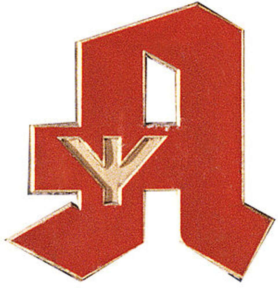
The pharmacy logo is probably one of the most well-known logos in Germany and has not been suspicious to most people so far. Now moderator Jan Böhmermann is demanding a new logo – because the current one is a “Nazi sign”.
A large red A, a bowl and a snake: The pharmacy logo is one of the most well-known symbols in Germany. Whether it also looks nice is a matter of taste – Jan Böhmermann apparently had a clear opinion on this for a long time, as he explains in the joint podcast with Olli Schulz.
There he initially describes the sign as “an aesthetic, creative insult”, but then goes on to say that while on vacation, the TV presenter discovered another reason why he believes the logo should be abolished.
Pharmacy logo is criticized by Jan Böhmermann: “Nazi symbol”
During a little research at the “German Pharmacy Museum” he realized that the striking red A was created during the Nazi era and was therefore a “Nazi symbol”. The background can be understood on the museum’s website: In Germany there were originally many different logos that were created individually by the pharmacy owners. A problem for customers: pharmacies could not be recognized at first glance, and there was no “quality mark” for the entire branch.
As early as the 1920s, there was therefore the goal of creating a common logo. The problem: there were several of these efforts, so that once again no uniform logo could prevail. Another illustration with three spoons (corresponding to the advice to take medicine three times a day) was the most successful, although this symbol was used by only 30 percent of pharmacies.
The logo debate actually picked up new momentum during the Nazi era: the spoon logo was initially only used as a “quality mark”. In May 1936 there was finally another competition of the German pharmacists who had been brought into line. Result: The red Fraktur-A with a Germanic rune, which is known to this day. The only change to the logo came after the end of the war: the runes were painted over, and in the late 1940s the chalice and snake were finally added.

However, it is disputed whether it is actually a “Nazi sign”, as Jan Böhmermann felt: Although the logo was commissioned and distributed during the Nazi era, the logo was created by an artist who lived with a Jewess. Because Paul Weise refused to separate from his wife, he was temporarily even banned from working.
Sources:Jan Böhmermann
Source: Stern
I am a 24-year-old writer and journalist who has been working in the news industry for the past two years. I write primarily about market news, so if you’re looking for insights into what’s going on in the stock market or economic indicators, you’ve come to the right place. I also dabble in writing articles on lifestyle trends and pop culture news.


