Image: Municipality of Ansfelden
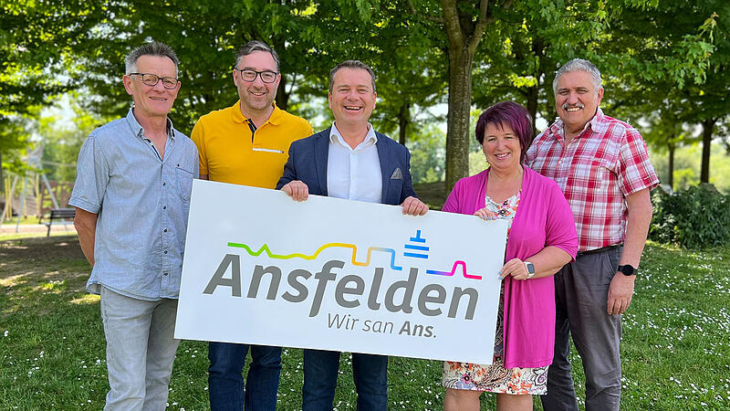
The process of developing the new “Ansfelden” brand began last year – yesterday evening, on the first day of the festival weekend celebrating 35 years of the city of Ansfelden, the fruits became visible in the form of the new logo. In addition to politicians and the city administration, the people of Ansfelden themselves were involved in the development process, and the city logo was designed by the Leondinger agency Sery Brand Communications.
The logo references the “skyline” of the city: from the natural hilly landscape to the urban living space to the strong economic and industrial region. And of course the television tower, which can be seen from afar, as an “emotionally charged symbol of coming home to Ansfelden” should not be missing.
The saying “We san Ans” refers to the conscious acceptance of differences, but above all to similarities, says Mayor Christian Partoll (FP). True to the motto: “I’m Haider. You’re Nettingsdorfer. But we have one thing in common: We’re all Ansfeldner. We’re all Ans.”
At the same time, the “Ans” can also be understood as the number one and as a literal abbreviation of the name of the municipality.
“The new brand aims to strengthen people’s identification with their city. We’ve been missing that so far,” says Partoll, who thanks everyone who accompanied and supported the project. “We’ve never had a process like this before.”
Source: Nachrichten


